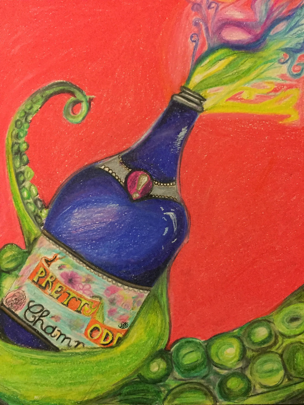
Don't Panic!I did this piece under the 2-D category focusing on the positive/ negative space and contrast. With this piece I wanted to do full color to create contrast between the colors. That's why I chose to use Prismacolor pencils. The main focus of my art was the champagne bottle and the octopus tentacle. I used bright colors but still colors that are in the cool family, using blues and greens and a hint of a few colors. I created contrast by filling the negative space with a bright red to make the green pop. I based this drawing on my favorite band Panic at the disco and pulled reference from each album.
|
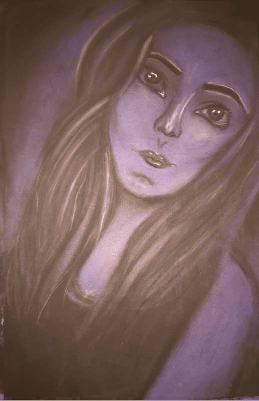
Self Portrait |
|
This piece in particular was pretty difficult for me I struggled with coming up with an idea and I went through many different ones. The lack of detail I was able to put into the figures because they are figures was quite frustrating. But i tried to stay with the idea of figures and just have lines. I had a rough time with blending the black and the blue water color, it wasn't as seamless as I would of liked it to be. Finally I'm proud of this piece and how it was out of my comfort zone and i was still able to make it my own.
|
Under Da sea

This was my first time using oil paints. It was quite difficult for me to not use a brush an only a pallet knife. I liked blending the water but it become more hard to blend in the tail and hair because it mixed with the blue and created not so satisfying colors and I had to find ways to cover those up. All in all I liked how most of the parts turned out and still would like to work on my skills in this area.
This project in particular was something that had to wrap my head around. I'm not used to very small precise lines. Shading using the lines was also difficult for me. This was my second time attempting to do this contour line drawing.
And this one was much more successful in terms of making shapes with the lines. But I drew a queen because of how queens are very powerful and strong women. I drew inspiration from a deck of cards I had and my favorite card is the queen.
And this one was much more successful in terms of making shapes with the lines. But I drew a queen because of how queens are very powerful and strong women. I drew inspiration from a deck of cards I had and my favorite card is the queen.
I started this piece after multiple brainstorms and finally decided to do very exaggerated fruits. The fruits not being proportional at all was completely on purpose just to show different details of the fruits. Some like the pomegranate and Kiwi could definitely have more details I think when I have time I will definitely go back and adjust a few things. The random fruits were to show vibrant color, to have as little negative space as possible. I struggled with realism but then tried to stray from that and make it less realistic.

In my series I incorporated pomegranates as being the main focus mainly because they are my favorite fruit. They have so much detail and color that I wish I focused more in depth on. The pomegranates in the other two pieces are out of the natural element so I wanted this piece to focus more on that than a non realist version on a pomegranate. I would definitely like to go back and adjust and add some definition to the leaves.

lost

.Walk in my shoes.

.Fate.

This piece was fun to create in many ways the use of color and reading about tarot cards was very interesting. There is some things I would like to adjust, one would be the eye. It lacks in detail and looks to flat I would like to add more demention. Secondly the crystal ball is also very flat and doesn't give off the impression of the ball and the colors/ smoke it's supposed to have. I would like to go back and adjust these. I do like the piece because of the color and all the complimentary colors.
.It's A Hoot.

.Waves.

One of my goals is to work on my skills with different mediums. I have chose oil to start with. Oil is very complicated to work with but also very easy to experiment with. I did my last piece with oil and didn't like the way it looked so this time I focused on more detail and correct colors. I think much more detail could be added and I will go back and add those.
.Beauty.

