I collect things
December 14, 2018
Who are you?
October 20, 2018
Where’s my mom
December 10, 2018
Dino
Mrs.Oryan I will finish this
Sick
Jan 10, 2019 Photography

December 2019. Pen, Colored Pencil, and Gel Pen.
Forge
January 2019: Photography
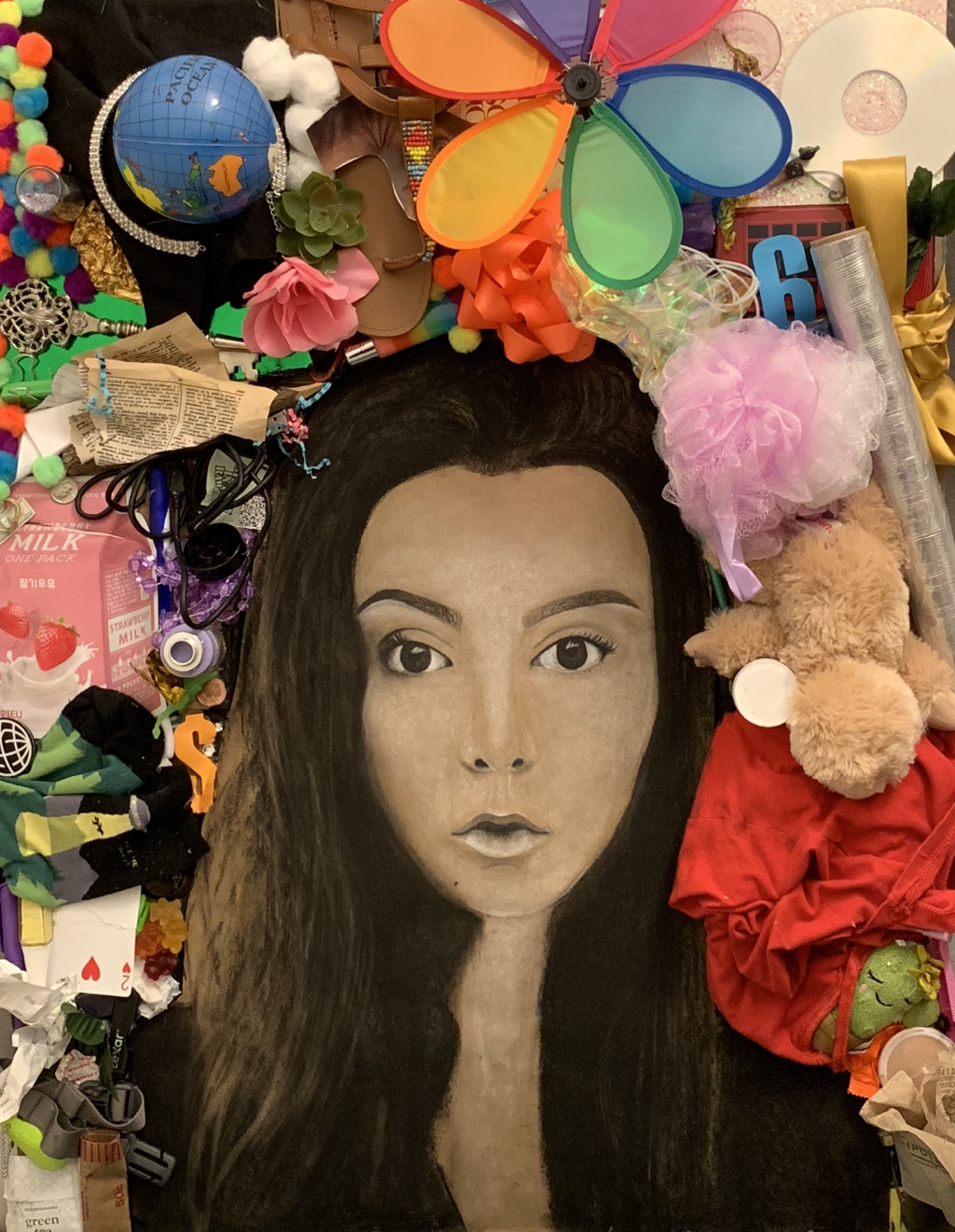
project 1:I collect things
Define which techniques you tried and mastered? Struggled?
This project was my 3rd attempt at a self portrait my whole art career. I struggled so much with proportions. I find my skills are better in drawing objects than people. All though I tried to draw the grid as perfect as possible towards the middle I realized that I had to no longer use it as it was not making my drawing proportional. I also struggled with knowing how much paper to leaving showing and how much white to use in my face. I think I mastered my eyes and my hair/ face shape. The drawing looks some what like me but also like a alien version of myself. I think I am missing some values with in the face to make it appear more realistic. I attempted to do this but realized there was too much gray appearing so I erased the marks and left the white and only some shadows.
2. How did you draw inspiration from other artists techniques or aesthetics in your work? In what ways did you derive meaning or gain historical perspectives from their work? Why these artists?
I mostly used the art work of my class mates as they were the artist I used to see there errors and techniques. I had a pretty interesting conversation with my classmate Derek about how he used the white charcoal. He told me less is more as he realized his mistake of placing too much white within his face. Then I talked to my classmate Tanner who used no whites and only the willow charcoal. Both perspectives helped me used a mixture of both in my art piece.
3. Describe the evolution of your piece. Decisions made. Compositional elements.
Originally I hated the idea of a self portrait because I was hesitant on drawing a person,even if it was my own face. The idea of adding words also stressed me out and I wasn’t sure how I wanted to do that until the end. As I began to wrap up my piece I noticed that it being a self portrait I should include a large portion of myself. So I decided to include the element of the fact that I am a mess and a hoarder. I have always been ever since I was little. It’s a mix of just a mess and organized chaos. So I decided that I wanted it to look like I was being consumed by all the random objects. I wanted to included a 3D event and decided to construct a box out of foam board that kinda failed proportionally. I then left it for a few mouths and came back with a new idea using mountain's as my muse, and how people draw layers of mountains to represent depth. So I cut up cardboard and layered them in a random stacked pattern and glued as many random colorful objects as I could find in my room.
4. If you could consider doing something over, explain why you would do this and what you would do next time?
I would of liked to practice in my sketch book a little more so I could of attempted to work with the willow and white charcoal to fix the parts of my face that show value. I also wish I would of erased my grid lines as some are showing through my final piece.
5. Elaborate on how this piece links with your other pieces? What is the common thread?
My theme is youthfulness that focuses on color. This piece is huge and has a lot of color, the objects with in the piece are also related to childhood.
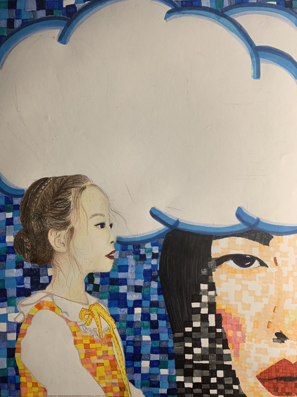
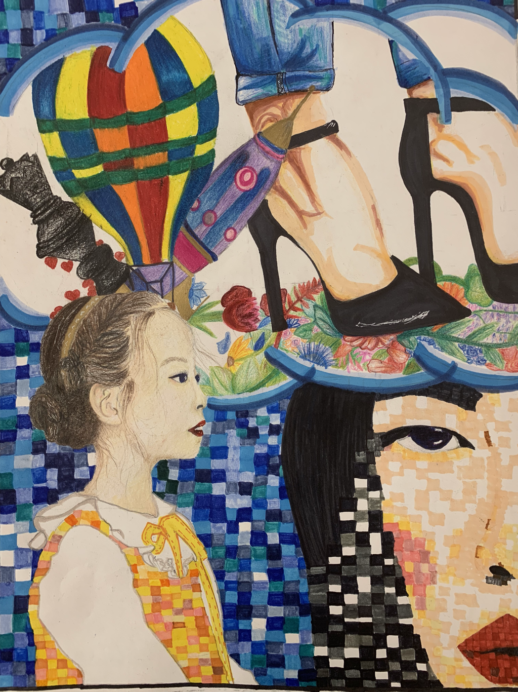
Project 2: Who are you?
Define which techniques you tried and mastered? Struggled?
This also was one of my first all marker pieces. I tried a variety of different markets prisma markets, crayola, and another unknown brand. I went for a realistic meets abstract idea, something I have not done. I also tried to improve on my skin tone but using colored pencils. I struggled with using the colored pencils to do texture in the hair . I realized after I should have left the cloud blank instead of adding all of the items. I think its takes away from the two girls.
2. How did you draw inspiration from other artists techniques or aesthetics in your work? In what ways did you derive meaning or gain historical perspectives from their work? Why these artists?
This work was piece wasn’t really based off of any other artist. I just used reference photos of photos I thought were unique.
3. Describe the evolution of your piece. Decisions made. Compositional elements.
I originally was going to do two large faces both pixelated. The decided a younger girl would fit into my them better. I also changed the younger girl to be more realistic as it’s supposed to mean how this young girl had a specific idea of how she wanted her life to be and her older self is not living up to her idea even if they were childish. Both girls are located in the lower left s d right thirds.
4. If you could consider doing something over, explain why you would do this and what you would do next time?
I wish I would of taken more time with my pixels to make them more even. I also would if like to not have rushed through the young girls hair. I actually hate the inside of the cloud as I don’t think it firs as-well as I originally intended. So I would of like to not have done that part of the piece
.
5. Elaborate on how this piece links with your other pieces? What is the common thread?
The meaning behind this piece is how as a child we all in vision god we want to be when we’re older. These ideas rang from the possible the maybe the slightly impossible. But naturally as we all grow that creativity is lost as-well as for our dreams they shift. Moving from more child like to adult like. Going with youthfulness how can one be realistic while still pleasuring their younger self.
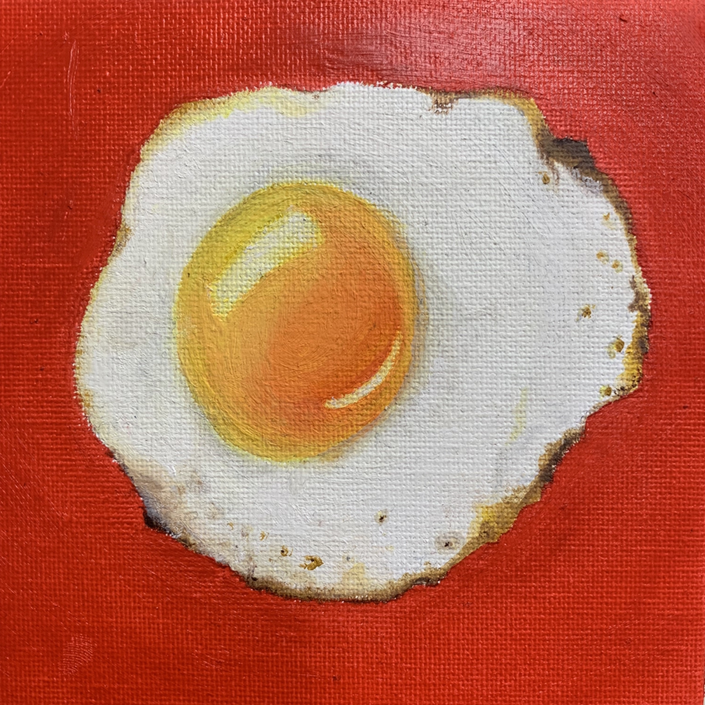
Project 3: I miss my mom
Define which techniques you tried and mastered? Struggled? This is one of the few oil paints I would consider a success. I have only done a few in the past that I found were not just globs if paint. I struggled with finding the right balance of color to add with in the egg to show some of the shadows. Mastered before getting to the shadow steps I think I mastered everything else to make the painting look like an egg.
2. How did you draw inspiration from other artists techniques or aesthetics in your work? In what ways did you derive meaning or gain historical perspectives from their work? Why these artists?
I just kinda started painting an egg. Which then lead me to next want to paint a chicken.
3. Describe the evolution of your piece. Decisions made. Compositional elements.
So I painted the egg first. Then I will paint a slightly larger baby chicken and a momma chicken. I decided I wanted to do a piece on veganism and hopefully when I get there make it comic book style.
4. If you could consider doing something over, explain why you would do this and what you would do next time?
Practicing the shading first before starting the final project. I struggled with layering the oil paint using whites.
5. Elaborate on how this piece links with your other pieces? What is the common thread?
This piece is actually a random series and doesn’t quite link up with my other pieces. There is a sense of youth with the baby chicken but not the narrative I want to show In my exhibition.
Project 4:
1. Define which techniques you tried and mastered? Struggled? I tried prismacolors and the texture of animal skin, more specifically dinosaur skin.I struggled with time management.
2. How did you draw inspiration from other artists techniques or aesthetics in your work? In what ways did you derive meaning or gain historical perspectives from their work? Why these artists? I drew inspiration from a book I found in my room and Ms. O’ryan’s video from the second edition of the Jurassic Park movie.
3. Describe the evolution of your piece. Decisions made. Compositional elements. I originally was going to draw it on a smaller piece of paper, but I decided on a larger piece to be able to add more detail to the dinosaur. Also, I layered white prismacolor as a foundation to make other colors pop off of the black paper.
4. If you could consider doing something over, explain why you would do this and what you would do next time? I would finish it on time. Sorry Ms. O’ryan, I will submit a better response to all of these questions at a later point.
5. Elaborate on how this piece links with your other pieces? What is the common thread? It links with a series that currently consists of two other pieces of a frog and a crocodile. They all have similar colors used and have little elements such as bubbles to connect them all.
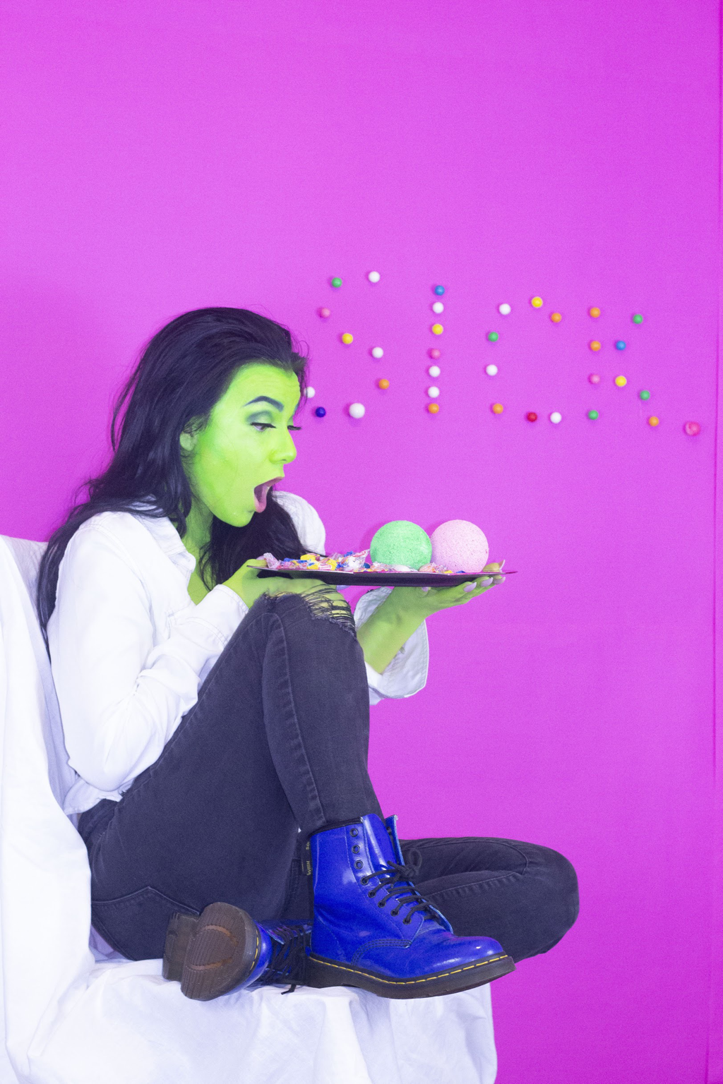
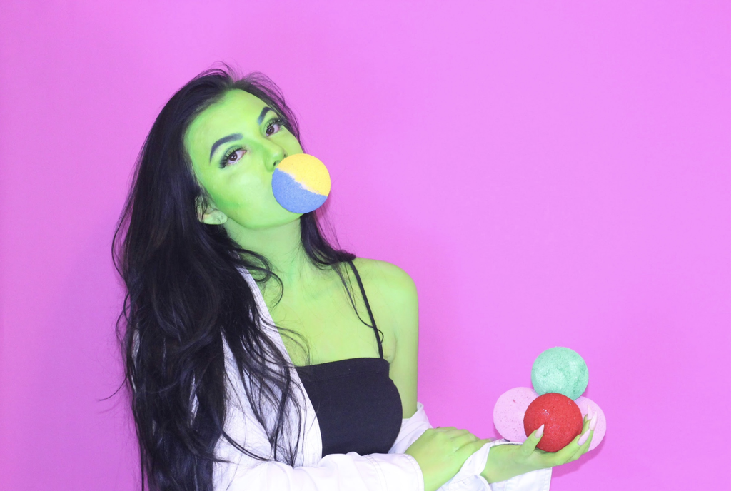
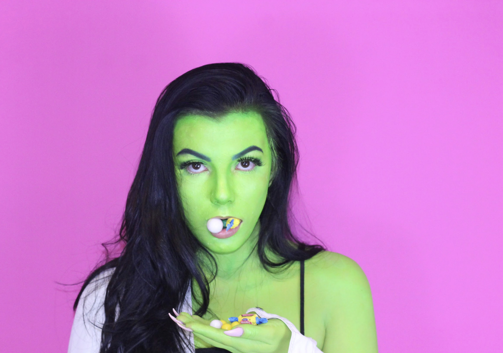
Project 5: Sick
Sick Photo series
1. Define which techniques you tried and mastered? Struggled?
This was the second photo shoot that I have done and completed it solo which was incredibly scary. I was nervous because I am not comfortable with cameras and I struggled. I also am not comfortable with makeup and decided that I was qualified to put makeup all over my body. I watched many videos and observed an uncountable amount of makeup/body paint photos to aid these process. I did not master these techniques but I was confident with the outcome. Also the concept of modeling I am not the best at as I find being in front of the camera uncomfortable as well, during this process I had to get over that fear.
2. How did you draw inspiration from other artists techniques or aesthetics in your work? In what ways did you derive meaning or gain historical perspectives from their work? Why these artists?
I drew inspiration from an artist I found on Twitter, Sarah McGonagall. She specializes in photography and body paint/makeup. She has incredibly creative ideas and focuses heavily on color and each shoot has a specific theme. She did a futuristic version of the wicked witch of the west and I used that image as inspiration. I also watched many youtube videos of people transforming themselves into Elphaba. This was the most helpful as it allowed me the ability to make my first time using body paint not look completely terrible.
3. Describe the evolution of your piece. Decisions made. Compositional elements.
When I first began thinking about my project I knew I wanted to add to my previous piece Sickly but was unsure how I wanted to execute. I contemplated doing another drawing or painting of the green subject. My original idea was to draw her in a futuristic style.
I thought about a woman in her older years still emanating the message of youth with color while emphasizing her wrinkles and a very expressive face. The second idea revolved around a different character with new colors representing the opposite meaning of youth and confidence. I sketched my ideas and came to the conclusion I wanted to transform myself into this character. I wanted the same concept to be portrayed using the same green and pink color scheme as I found it eye-catching. I didn't want the background to pull too much attention away from myself as the subject as the message is about youthfulness. After doing a few solo photos is when I decided to glue the gumballs to the wall spelling sick, to give the background texture and a connection to the title.
4. If you could consider doing something over, explain why you would do this and what you would do next time?
I would have invested into a higher-quality body paint to avoid the streakiness when I applied it. I would have liked to do the shoot again if it didn't break my skin out. I would have liked to potentially do photos outside to explore a range of backgrounds.
5. Elaborate on how this piece links with your other pieces? What is the common thread?
I created this piece in order to connect to my art piece Sickly that I completed last year. I enjoyed the concept and color scheme of the complementary colors of green and pink. I thought it would be a unique challenge and give the original more meaning. As the theme of my show is youthfulness I wanted to immerse myself into this idea as I am constantly reminded that I have to become an “adult” very shortly. I wanted a piece that would draw attention to my show and decided the photos would be great to get developed as big as possible and plan my show around these colors, as I use red, greens and pinks and greens.
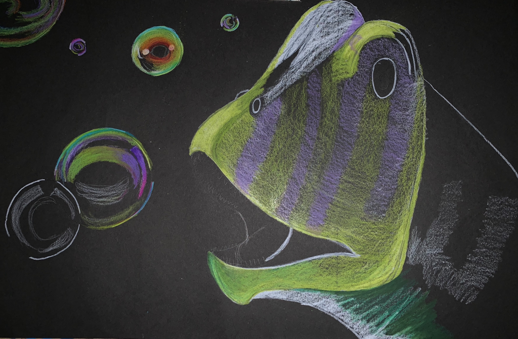
Project 6: Fish, Eat Me
1. Define which techniques you tried and mastered? Struggled?
I used the background of pages from books back when I was in eighth grade and have always wanted to redo it. Having said that, the paper is incredibly fragile and thin. I struggled with no tearing the paper as I was using colored pencil and adding multiple layers is difficult to not tear through the paper. I have done sketches with pen but never a finished piece. I completed the figure with an average pen I found in my art bag. I think I have a long way to go in order to say that I mastered ink or pen drawings but it was a nice start. I also stray away from human figures as I have a difficult time with proportions but I wanted to try again. I originally wanted to add more body parts but I was limited by the paper size as I realized that the piece would become crowded. I am on a journey to master colored pencils so this was a piece to further that development.
2. How did you draw inspiration from other artists techniques or aesthetics in your work? In what ways did you derive meaning or gain historical perspectives from their work? Why these artists?
I explored on pinterest and found photographs of models and different fish. Sadly the artist are not listed only the user who posted the photo or random websites. But they were inspiring as I got to see colors and up close images of the fish.
3. Describe the evolution of your piece. Decisions made. Compositional elements.
This piece was driven from a weird concept I thought of over winter break. I have recently wanted to purchase a fish but I am scared that I may kill it on accident. I started to think about how these fish have no choice in this way of life and are placed in situations where this happens often. Due to this I thought what if the fish decided to eat people instead. The background was an idea I reused from when I was in middle school. I thought that it would be a nice contrast under the pen and the yellow tint would contrast the color of the fish. I also thought it would be a cool idea for the fish or the sea to use the body as a home of some kind. I wanted to include a wide variety of body parts but the paper was too small.
4. If you could consider doing something over, explain why you would do this and what you would do next time?
I would of liked to use a bigger piece of paper. I also would of used stronger glue or added more paper to all corners of the paper background to avoid tearing.
5. Elaborate on how this piece links with your other pieces? What is the common thread?
Sadly I was unable to connect this piece of my theme as it was a spur of the moment idea. It is very mythical and creates a fiction narrative that I could connect to my idea of Youthfulness but I feel that I would be stretching the meaning of the peace as well as my theme.
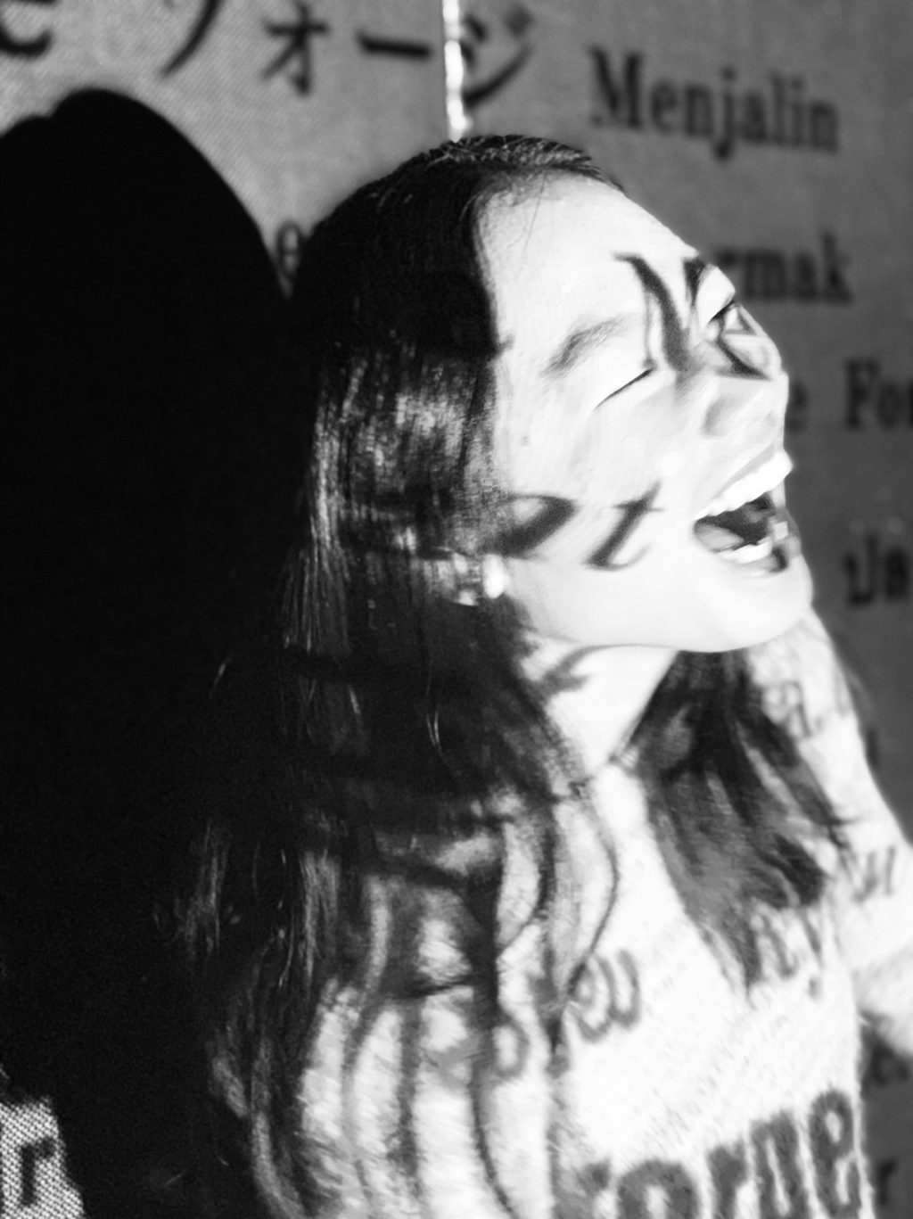
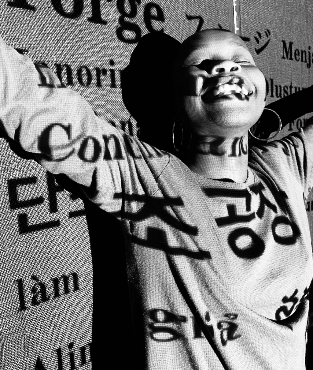
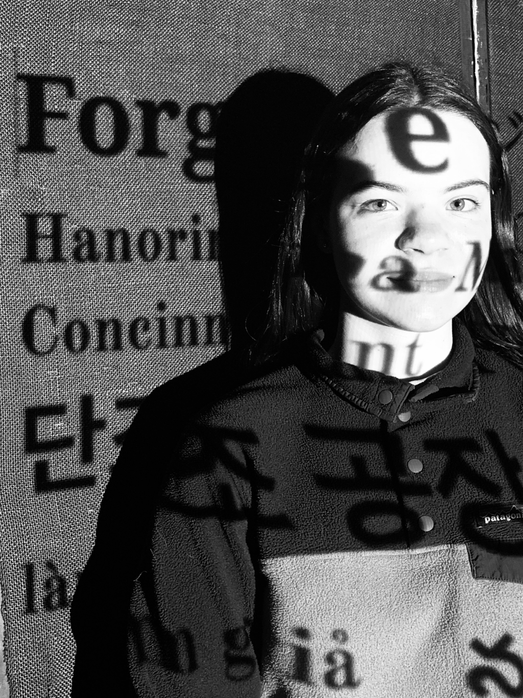
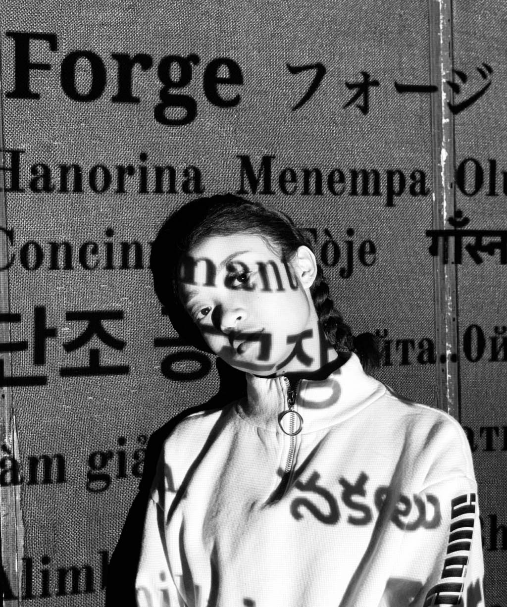
Project 7: Forge
